I'm overwhelmed
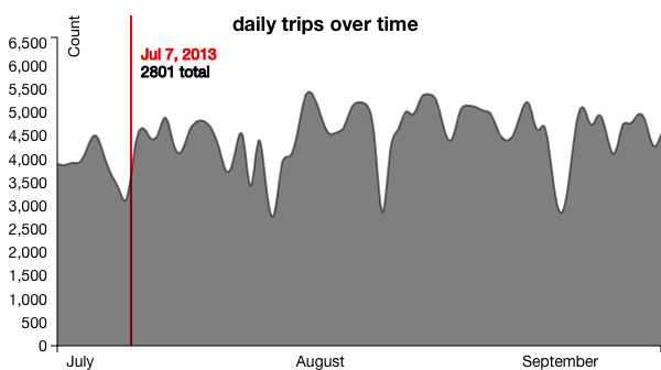
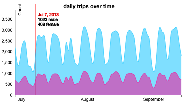
The big line graph just shows the overall daily counts. When you click on any of the pie charts, that data populates this chart. Like this:


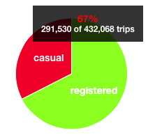
The pie charts show the breakdown of the all the trips. Note that while all 1.6 million trips are classified as either casual or registered, and either leisure or commuter, we only have gender and local information for the registered users, who make up 75% of all rides.
When you click on these charts, their information populates other charts on the page

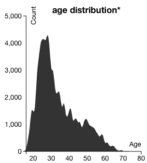
The age distribution show the distribution of the ages for all of the trips taken by registered users.

The brush lets you select a subset of trip information based on time. The background graph just lets you know where you can find data over the course of the years.