Overview and Motivation
About Hubway
Hubway is a bicycle sharying system in the Boston area. Launched at the end of July in 2011, Hubway started with 61 stations throughout the city and 600 bicycles. In the time afterwards, Hubway expanded to the neighboring cities of Cambridge, Somerville, and Brookline. Since its launch in 2011, Hubway has grown to more than 140 stations and more than 1300 bikes.In 2013, Hubway in partnership with the Metropolitan Area Planning Council, released data from more than a half million trips that were taken on Hubway bikes between its launch on July 28, 2011 until the end of September 2012. Their mission? Ask the public to put together a visualization of all the trip history. While the challenge itself has officially closed, we decided to take on the Hubway and MAPC visualization challenge.
The Team Datahub Way
We are Team Datahub, and we are on a mission to visualize this bike sharing platform. As students, we make use of many forms of alternative transporation to explore and commute around Boston. In particular, bikes are a popular, affordable method of transportation for students, professionals, and tourists alike. We want to understand more about who uses bikes and for what purpose, as well as how people get around Boston. Our goal is to find answers to these questions for ourselves, and create a visualization for others to discover the answers as well.
Related Work
Anything that inspired you, such as a paper, a web site, visualizations we discussed in class, etc.
The Hubway Visualization Challenge has already come to a close and awards were given out to visualizations in a few categories: Overall Best Visualization, Best Analysis, Best Data Narrative, Best Data Exploration Tool, People's Choice, and Honorable Mention. Despite these being available, we made it a point not to look at the winner's examples. We were intent on not allowing other designs to fixate our own focus. However, there is a possibility we were slightly influenced by some of the winners--since we were able to see the narrow screenshot of each winner, as shown below.

We also decided to look at some inspiration from a different mode of transportation--taxis. There are a couple visualizations recently about the travel of taxis throughout New York City. Therefore, we took a look at a visualizations tackling this problem. These are available here and here.
Questions
We set out with three main questions that we hoped our visualization would solve. These three main questions guided our visualization in the way we structured our data, the way we designed our visualization, and the ways in which we hoped viewers would interact with our visualization. We wanted to make sure our visualization would allow viewers to ask these same questions for themselves, discover answers on their own, and make new and interesting conclusions. Without further ado, here are the three questions Team Datahub set out to answer.
#1 Why do people use Hubway?
When people use Hubway, what are they doing? Are they rushing to work during commuting hours? Are they visitors using bikes to get around the city more easily? Are they taking a leisurely stroll on the weekend? We wanted to help our viewers find and explore the answers to these questions and hopefully, get a better idea of the use cases of Hubway trips.
#2 Who is using Hubway?
We wanted to find out more about the riders themselves. Are they visitors or live here in Boston? Are they male or female? Are they old or young? Are they commuters or leisure riders? In answering these questions, we are able to get a better understanding of the people on the bike.
#3 Where's everyone going?
We wanted to discover the Hubway hot spots--the places people use bikes most often. This includes finding out which stations see the most traffic, but also which routes see the most traffic. Are there stations that act as the Hubs of all activity? Are there stations that see more incoming than outgoing traffic? Are there certain routes that are extremely popular? Are there certain routes that have never been taken on a Hubway bike? We decided to create a visualization that would answer these specific questions, and in result, allow our viewer to see where everyone is going.
Data
In 2012, Hubway and the Metropolitan Area Planning Council announced a challenge: they wanted the public to visualize the data from more than 2 million Hubway trips over the course of 13 months. To do so, Hubway released the data of their trip history. This means that anytime a rider checked out a bike from any one of the now 140 Hubway stations, the system recorded some basic information about that trip.
- Duration The length of the trip, in seconds. We wanted to use the duration to look at what sort of trips riders were taking. We wanted to define each trip as either a leisure ride or a purposeful ride. For our purposes, we converted this to minutes, eliminating any trip that was less than 60 seconds. (Often, those trips are "trials" by people.)
- Start Date + End Date We wanted to use the dates and times to determine a number of factors concerning how riders are using Hubway. This would potentially give us a better idea of riders' purpose for riding. Do riders ride more on weekends or weekdays, and are there busier hours or months? This could tell us a bit more about leisure trips vs. commuting trips. Do riders ride during peak rush hours or in the off-hours? This could also inform us about the trip's purpose.
- Start + End Stations Each station has a unique ID number as well as the station name. The start station is where the bicycle is checked out from and the end station is where the bicycle is checked back into. We can use the station information to find the "Hubs" of Hubway--which of the stations are most popular as starting locations and end locations. We can use the start and end stations together to get an idea of whether trips are Point A to Point B or are roundtrips. Lastly, we can use this information to find the most popular routes that people take.
- Bike Number Each bike has a unique bike number. This bike number can be used to track every trip a bicycle has made during the dataset time period. We were curious about using the bike number as a way to track how a single bike might travel throughout the city during the dataset time period.
- Member Type On Hubway, there are two types of users: both registered and casual users. Registered users have signed up for a Hubway subscription. At this point in time, Hubway subscriptions are $85 annually or $20 monthly. Casual users have signed up for a shorter subscription--either 72 or 24 hours. In both cases, any ride under 30 minutes is free. However, rides that takes 31-60 minutes cost an additional $2 and rides that take 61-90 minutes cost an additional $4. Beyond that, every additional half hour costs another $8.
- Zip Code + Birthdate + Gender For trips taken by registered users, the dataset has some additional data points. First, the zip code given for a registered user. Since Hubway is limited to the Boston area and there are zip codes outside of the Boston area, we know that zip codes don't represent where the rider is at the time, but rather where the rider is originally from (most likely from credit zip code). We are able to use this zip code to determine which riders are visitors and which riders live in the city. Furthermore, we are able to use the birthdate given to get a better sense of rider's age. Lastly, we are able to use the gender to determine whether riders are female or male.
This data is available for download in a CSV file at the Hubway Data Visualization Challenge. We immediately ran into two main issues with the dataset. First, the dataset was a large file at more than 175 MB. Second, we needed to manipulate the data such that they were in the correct layout for our visualization.
scripts
To do this, Niamh wrote a number of Python scripts to both cut down the size of the data as well as to derive additional values. As a result, we have a number of CSV files with data for different purposes. Below is a list of Python scripts, their purpose, and the data files they produced.
create_matrix.pywent through each trip, determined whether or not the trip was on a weekend or weekday, and whether it was by a casual or a registered user. It then determined the neighborhood of the starting station (A), and that of the destination station (B), and tallied a trip in the corresponding array element (i.e. matrix[A][B]). Five separate global variables were made,_matrixData,_matrixWeekendData,_matrixWeekdayData,_matrixCasualData,_matrixRegisteredData, and stored in the filematrix.jseditdata.pytook in the raw CSV data from the Hubway Visualization Challenge, and removed extraneous information (bike number, any unique IDs, trip status). It also removed any trips that were not "closed" (only about 50), and removed any trips that were fewer than 60 seconds long. It converted the trip duration to minutes, and abbreviated many variables. It produces the filetrips.min.csvgetRoutes.pyBetween the 140 Hubway stations, there are 20022 unique trips possible, but since this includes going from A to B as well as B to A, and we wanted to save space, we felt it was an appropriate shortcut to reduce this to 10011 trips (essentially saying that the same route could be used by bikes going either direction).This script took in all 10011 possible trips, determined the starting latitude and longitudes of the stations in question from
stations.csv, and then queried the GoogleMaps Directions API. This returned the time & distance predicted for a bike trip between two given locations, and also gave us an encoded polyline that could be used to plot the trips on the map. The former allowed us to determine if, for a given trip, the user had taken moretime than normal to go a certain distance, and from that we determined whether the ride was commuting, or simply leisure (1.2x the Google Maps suggested time for biking along that route). Any trip that started and ended at the same station was marked a leisure trip. This information was used in the filestrips.min.csv,routes_stats.csv,stations.json, andstations_keyed.jsongetYearData.pyis a script that, well, frankly, served many purposes. A quick look is all you need to see that this wrote multiple data files at one point in its history. This script was used to take the trip data and- compile statistics about a given day of the year over the course of the 2-3 years (
yeardata.csv), - compile statistics about the distribution of ages over a year (
yeardata_age.csv), - and compile age distributions for each date Hubway was active in the span of the data (
age.csv).
- compile statistics about a given day of the year over the course of the 2-3 years (
getMinuteData.pyserved a similar purpose as that above, but instead derived statistics about 15 minute intervals over the course of a day, for both weekdays and weekends. For each 15 minutes interval, we include the number of trips started, length of the trips, duration, and who started them (male/female, registered/unregistered). This data is found intimeofdaydata.csvstations.pyis kind of a big deal. It brings together a lot of different data sets, derives statistics from them, and makes them available to the home page visualization. For each station, it calculates the average daily trips, as well as hourly breakdowns, for arriving and departing bikes, gender, registration type, and how fast those trips were. This is done overall, as well as each for weekend and weekday. The resulting files arestations.jsonandstations_keyed.jsonbreakdown.pyincorporates two main aspects: the total usage per day (and the regular breakdown metrics), and the weather conditions that day, which we got from NOAA & cleaned up a bit. This script madebreakdown.csv
Exploratory Data Analysis
Most of our exploration with the data happened during the process in which we manipulated the data and tested visualizations out. While manipulating the data we began to gain an idea of which parts of the data could give valuable insight into the trends of hubway riders. We knew from the start we wanted to use nodes and lines to represent the connections between the stations and routes, but we did not initially see the value in things like grouping the trips by the neighborhood they started at and which ones it ended at. Lexi is a local from Boston and is very familiar with the neighborhoods around Boston and Cambridge, but came up with the idea to display information about neighborhoods with a chord visualization to give users who are not familiar with these neighborhoods a look into which ones are most popular during the work week, weekends, etc. Niamh had heard about a bike called the Mayor's bike and knew that it was a unique hubway bike, and then came up with the great idea to follow it after Dayne came across a great dataset with the trip data for the bike. The rest of our exploration happened in an organic way as we tested out the best epxloratory tools to create for the visualization.
Design Evolution
From the beginning, we had a rather clear idea of what types of visualizations we wanted to implement. We wanted multiple views, with the option to explore with filters, ranges, and brushes. The initial sketches of our visualization concepts are displayed below.
 Figure 1: Map visualization by Hubway station
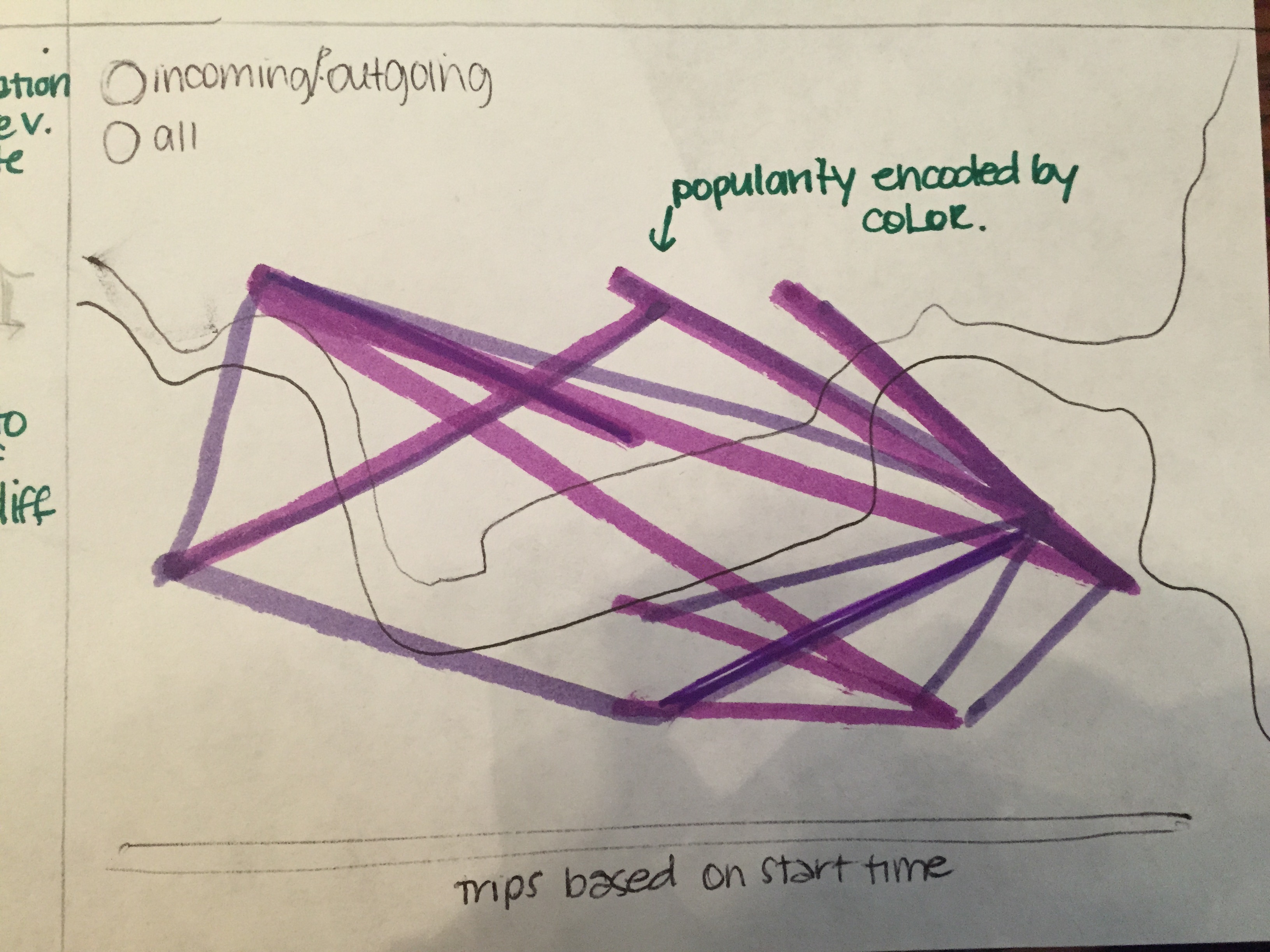 Figure 2: Map visualization of Hubway trips
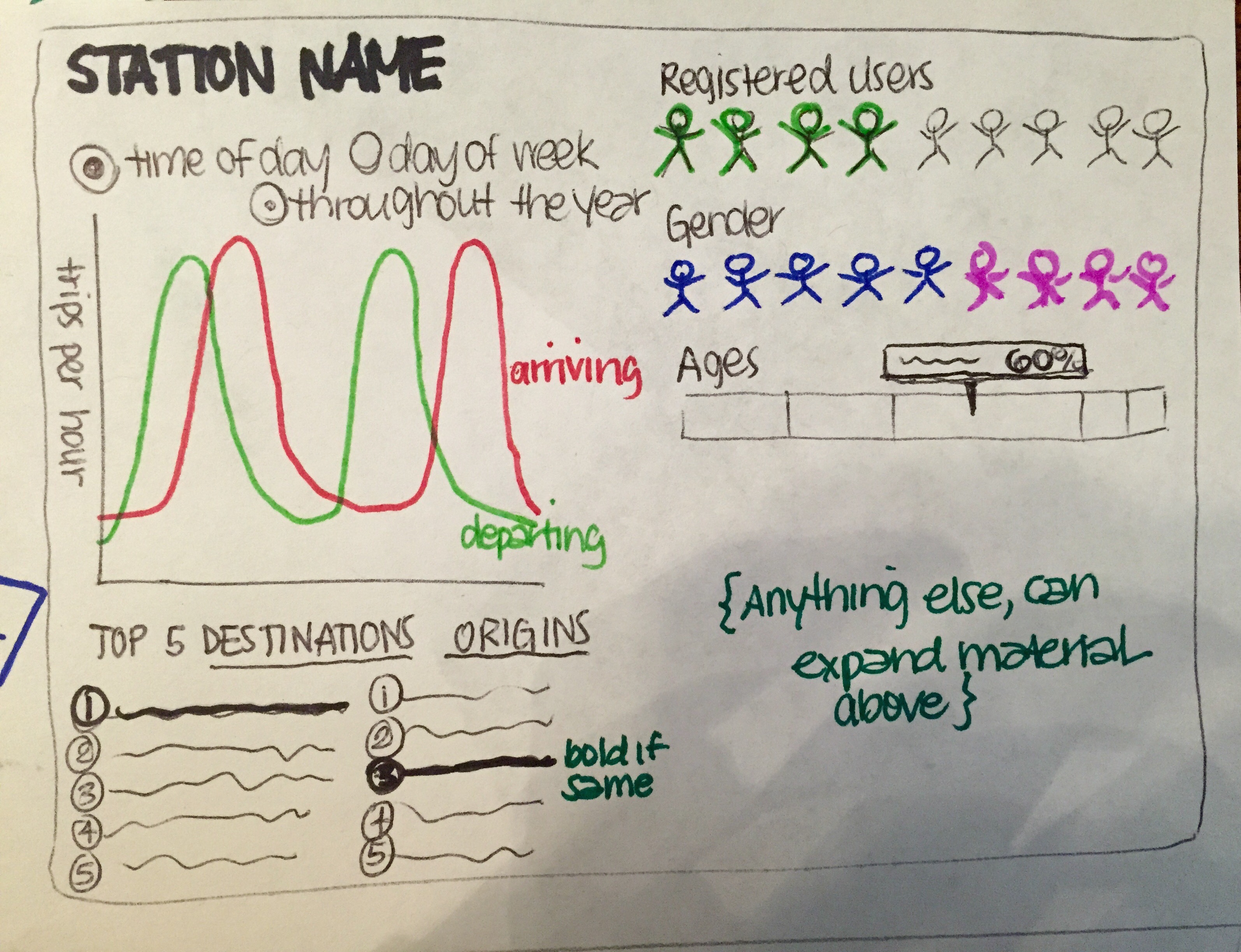 Figure 3: In Depth View of Hubway Stations
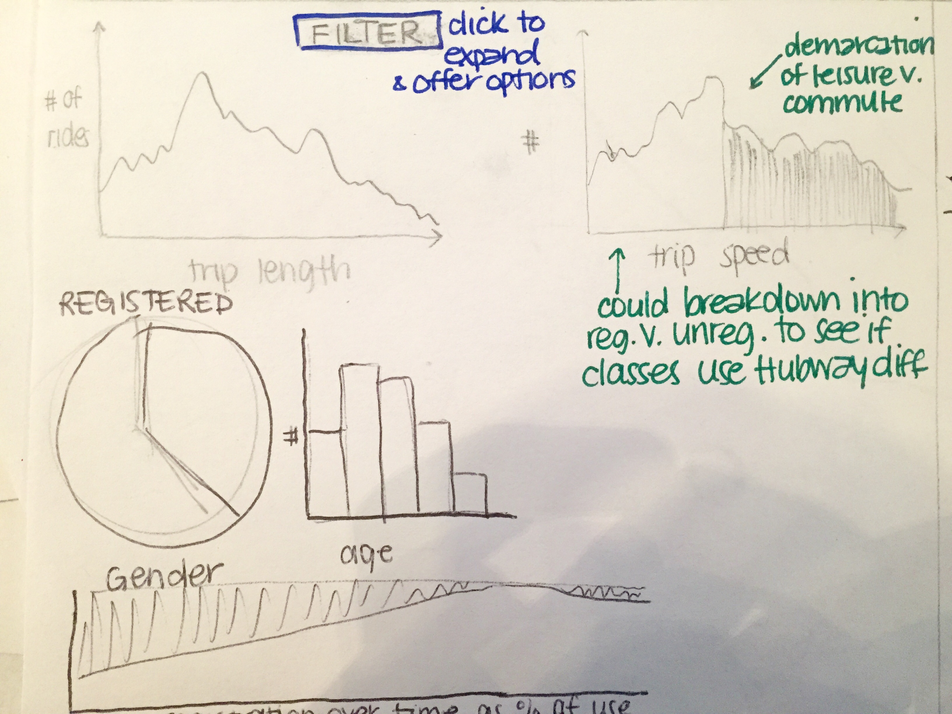 Figure 4: In-depth view of users
Our main view will be a map of the Boston, Cambridge, Somerville, & Brookline area. There will be two visualizations that you can switch between that are overlayed on the map. Figure 1 shows nodes at the station locations. Each node will vary in size depending on how a particular station is. You will be able to add filters for the time of day, gender, age, etc. that will modify the nodes. Figure 2 will be lines connecting the stations that will show the popularity of the route based on color. You will be able to apply the same filters from Figure 1 to this visualization. Also, hovering over a route can show more details of that route such as the average trip length, average speed, gender, and age of the rider. We also plan on having two more visualizations that will show other stats of the routes, stations, and the average user of Hubway (Figure 3 & 4). We plan on switching to these views by either clicking on a station or route. Each of these visualizations will also have some filters and a time slider to allow the user to see how they change over time.
We decided on these four main visualizations since they could answer our main questions: who (& why), when, where. We wanted to know why do people use Hubway, who is using Hubway, and where they are going. Using the four visualizations outlined above, we are able to show where they're going on a map view. Also, it allows viewers to explore more about who is using Hubway in certain respects. Furthermore, it allows them to draw their own conclusions about why people are using Hubway.
A week into the project, we decided that we should be working on a backup view in case we were unable to implement the map view exactly as we wanted to. We decided upon a chord layout that would depict the relationship between separate neighborhoods. This new view is shown in the figure below. The main screen shows the relationship of trips between the four cities--Cambridge, Brooklin, Boston and Somerville. The chords can be toggled to represent three different aspects--volume of trips, speed of the average trip, and average duration of the trip. Furthermore, any chord can be examined further to see additional user, station and trip information (as we also had in our initial design). Second, there is the option to select one particular city and look within that city. Therefore, if we selected Cambridge, we would then transition to a similar chord layout that displays all the neighborhoods of Cambridge (i.e. Porter, Central, Kendall, and Harvard Squares). We would be able to see the names of individual stations at this point. Like the previous design, this design encompasses all three of our main questions and gives the user the ability to explore.
 Figure 5: Chord layout design
By the time the design studio came around, it seemed that both layouts were each doable, but we would not be able to do both views. Therefore, we used the design studio to get feedback from another group whether to pursue the map or the chord layout. While the other team informed us that they did like the chord layout, it was clear that the map design was more intuitive and preferable for better exploring. Therefore, we decided to focus our efforts on the map layout moving forward.
Our next decision was to make the overview page a bit cleaner. The overview would now display stations and most popular routes on a map. We would give viewers the ability to explore further by showing rider demographics, top origins/destinations, and hourly traffic for each station. However, we would allow even further exploration into the who, what, and when by creating separate pages. Since time allowed, these pages would be a different, deeper look into our initial questions. We even decided to include the chord layout since time allowed. The following is a breakdown of our designs for the who, what, and where pages.
The who page would show pie charts for breakdowns on casual/registered, female/male, leisure/commuter, and visitor/local. It also shows the daily distribution of trips and the distribution for riders' ages. Viewers can further explore the rider breakdown by selecting a pie chart and seeing how the daily distribution of trips breaks down. For example, a viewer can select the male-female pie to see daily distributions of male riders and female riders. We also decided to give the viewer the ability to explore these breakdowns over time. The visualization allows viewers to brush over the entire time period that we have data from. This allows them to see how the breakdowns, daily trip distribution, and age distribution change over time.
The where page is the chord diagram of neighborhoods. In this layout, the groups are neighborhoods and the chords between them are the traffic between neighborhoods. We wanted to give viewers the option to filter--weekend/weekday and casual/registered. Furthermore, we decided that we would add a map to this page with stations so that viewers could see which stations fall into which neighborhoods.
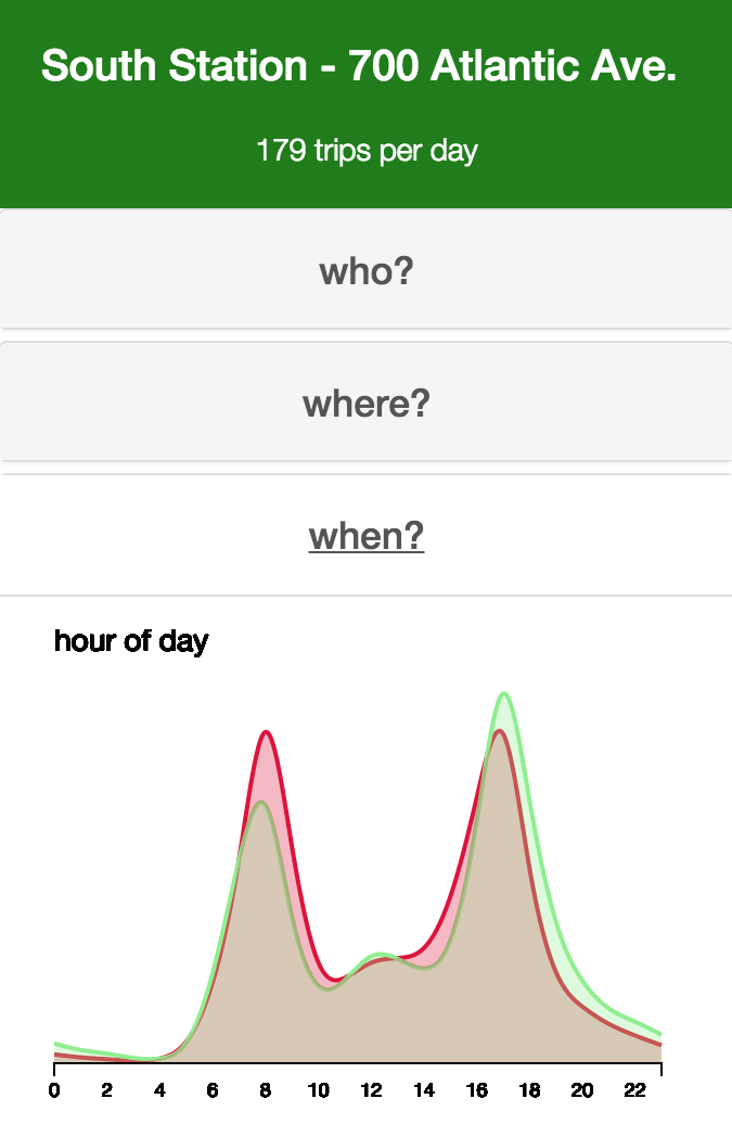
The when page would show a breakdown of hourly traffic. We would give the option to toggle between total/weekday/weekend. We also wanted to give the option to see difference in make/female, commuter/leisure, and registered/casual. We also wanted to give viewers the option to look at duration, speed, and distance of routes over the course of the day.
Lastly, we decided to add one last feature: follow the bike. There is a Hubway Bike deemed "The Mayor's Bike" (it looks special). We wanted to design a page in which viewers could follow where the bike traveled over time. As time passed, we wanted to be able to see where on the map the bike traveled, as well as the total distance/time it travels. We decided to show this on the map, with a distance + time + data + gender counter. Additionally, we decided to show the distance covered over time as the bike traveled.
The visualization that didn't make the final cut was WeatherVis, so named because we added daily weather data to the daily totals we had derived from the trip data. Early versions of it consisted of two axes, one with one weather variable (in this case, the daily average wind) and the other with another (daily maximum temperature). Each day was plotted according to these variables, and the daily trip volume was encoded in the mark's volume.
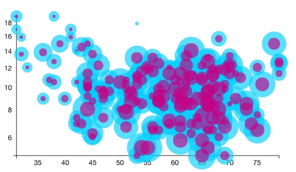
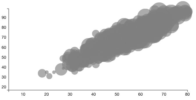
The issue arose when we actually tried to plot the data. Firstly, all of the nodes overlapped because of their volume, and since diminishing the volume would diminish how well we conveyed this third dimension of data, we relied on brushing to "filter" the data. Secondly, when we tried to breakdown the data (male/female, commuter/leisure, etc.), we ended up with even more circles on circles. As a final attempt, we shaded the circles according to how much the value for a given attribute varied from the average in a given time frame. This simply was not clear, and did not yield any fruitful information besides the fact that 51 crazy people rode Hubway on the day of Hurricane Sandy.
Initially, WeatherVis was in who.html, but as we worked to answer the questions more throughly, we realized this was not the appropriate panel for this data. Then, we tried putting it in when.html, but since one view would deal with data generalized for the period of a day, and this one would deal with data for each day from all years, there was no logical way to make these two interactive fluidly and coherently.
Implementation
Each visualization dashboard is addressed in its own section.index.html mapvis.js, stationvis.js
Our first step was deciding how to create a map view. After some research and experimentation, we decided upon using Leaflet and MapBox. More about these libraries can be found here and here. From here, we were able to create a map view, as shown in Figure 6. The nodes in the figure are sized in area according to the average trip volume per hour for that hub. Furthermore, the color of the nodes represent the proportion of average trip volume that is arriving. That means if more than 50% of trips are arriving, the nodes are green; if less than 50% of trips are arriving, the nodes are red; and if 50% of trips are arriving and departing, the nodes are grey. Both color and size of the trips are determined on a scale. Since all nodes fell between the 40%-60% range for arrivals, the scale for color is in a range from .45 to .55. In addition, we created a hovering option for routes that quick displays the two stations as well as the volume of trips.
 Figure 6: Map View
When it came to drawing the routes between stations, we ran into a problem. There were so many trips between stations that the map became essentially impossible to see. Therefore, at this point, we decided to show only routes with a minimum number of trips. Below, we have included views that include ALL routes (Figure 7), routes with more than 200 trips (Figure 8) and routes with more than 500 trips (Figure 9).
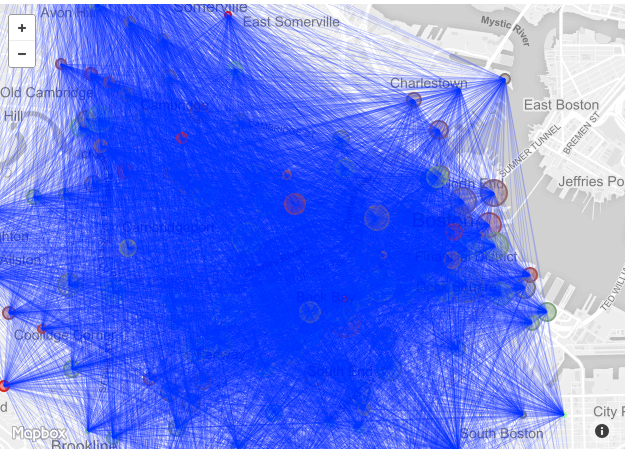 Figure 7: All routes
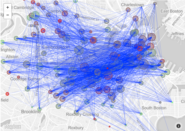 Figure 8: Routes with 200+ trips
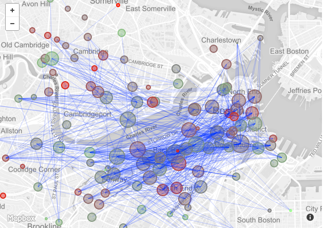 Figure 9: Routes with 500+ trips
Once we realized we could get polylines from the Google Maps Direction API, we realized we could plot the routes between stations more "true" to form. This simply meant decoding a polyline for each route, and adding it to the map (Figure 10).
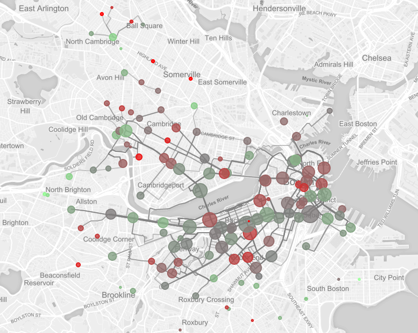 Figure 10: Routes with 750+ trips, plotted with polylines from Google Directions
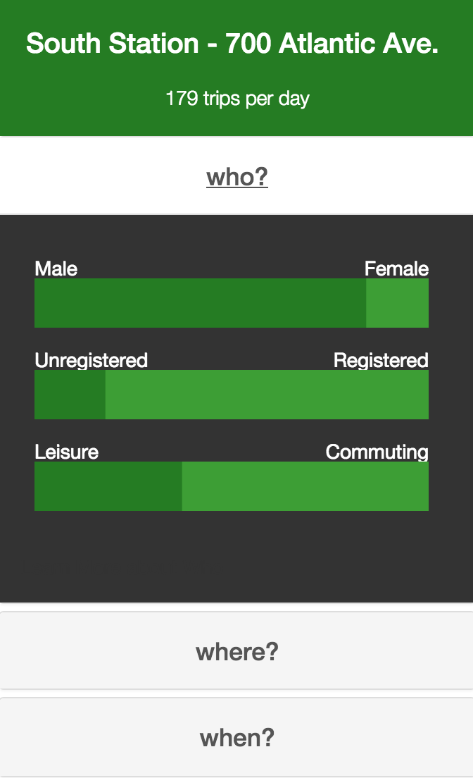
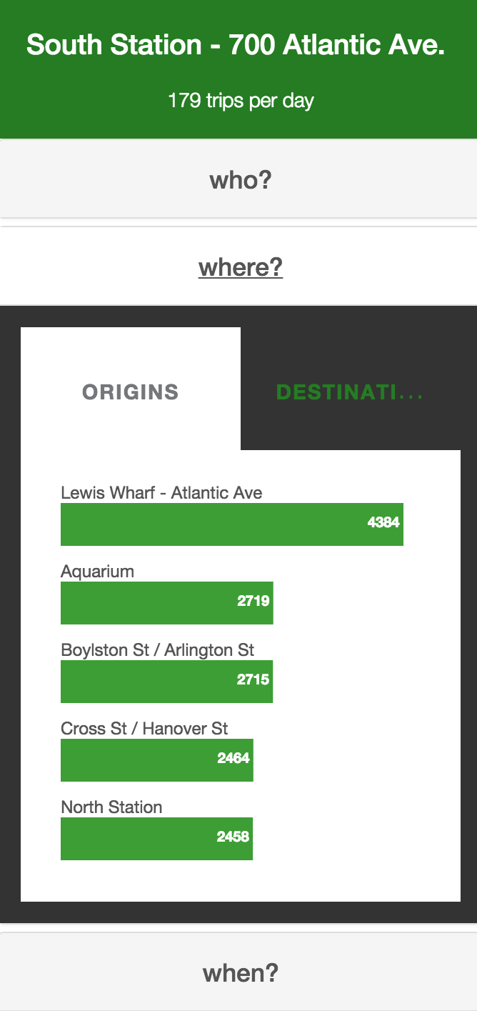
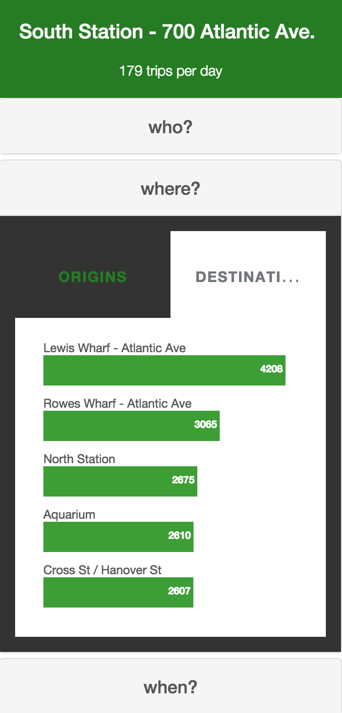
In order to further explore the map view, we created an exploration tool that dived deeper into the who, where and what of each station. On hovering over a station, we highlighted the trips in and out of the station. In addition, a menu slides out to show StationVis. The first tab on the menu reveals a breakdown female/male, registered/unregistered, and leisure/commuting composition of trips from that station (Figure 11). This menu also has bar graphs for the top 5 origins and top 5 destinations of that station (Figures 12 & 13). Lastly, the menu displays the total traffic at the station by hour of the day (Figure 14).
who.html whopievis.js, stackedvis.js, agevis.js, yearbrush.js
The who page allows viewers to explore the makeup of riders on Hubway. The visualization shows pie charts for breakdowns on casual/registered, female/male, leisure/commuter, and visitor/local. Each of these breakdowns is a separate WhoPieVis that shows the user composition into two segments. We allow the viewer to hover to see actual number of trips broken down. A sample of the first iteration of a pie chart is shown below in Figure 15.
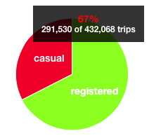 Figure 15: Original Pie Breakdown of Casual and Registered
The visualization also shows the daily distribution of trips with StackedVis. The quantity of trips are shown over a certain time period in a line graph. In addition, a viewer can hover over the line graph to see a specific day and the number of trips, as shown in Figure 16. The viewer can click any of the pie graphs and the distribution of trips will break down into the two subcategories. For example, if we were to click the gender pie graph, the distribution of trips would split into two lines--one for males and one for females. The hover would then show the specific trip breakdown. These features are shown below in Figure 17.
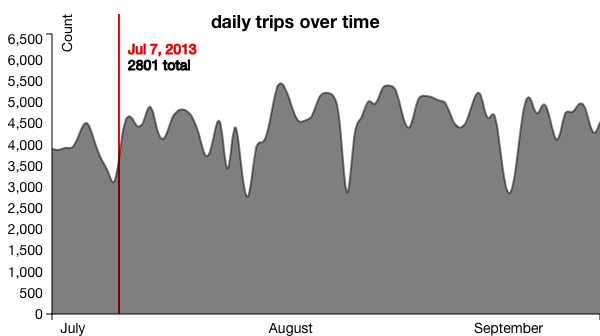 Figure 16: Daily Distribution of Trips, Total
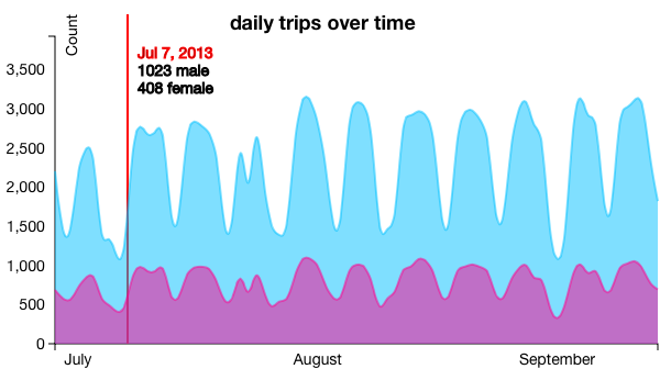 Figure 17: Daily Distribution of Trips, Stacked by Gender
Next, the page gives viewers the opportunity to see the distribution of riders' ages with AgeVis. The age data for registered users is only available through Sept. 30, 2012. We made sure to leave a note on the asterisk to let our viewers know this. While we were at it, we let them know that the age, gender, and ZIP code for trips are only available for datapoints from registered users. However, we also noted that registered users make up 75% of all the trips. The age distribution visual is shown below in Figure 18.
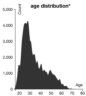 Figure 18: Age Distribution
Lastly, we gave the ability to brush over time to see all of the above figures. Originally, the brush was an hourly breakdown of time as shown in Figure 19. However, we decided that it would be more pertinent to brush over the entire dataset of time (i.e. years, not hours). The final brush is set over a background image so that viewers can easily see what the overall time looks like. From quickly looking at the brush, they can see that there is no usage during the winters and hence, the other visualizations will reflect this. The final brush was implemented as YearBrush and is shown below in Figure 20.
 Figure 19: Original Hourly Brush
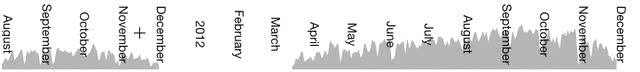 Figure 20: Final Year Brush
In the end, we decided to design the page to better reflect the Hubway data scheme. The result were changes to hover colors, pie chart colors, title colors, and line colors. These design choices are shown below in Figures 21, 22, and 23.
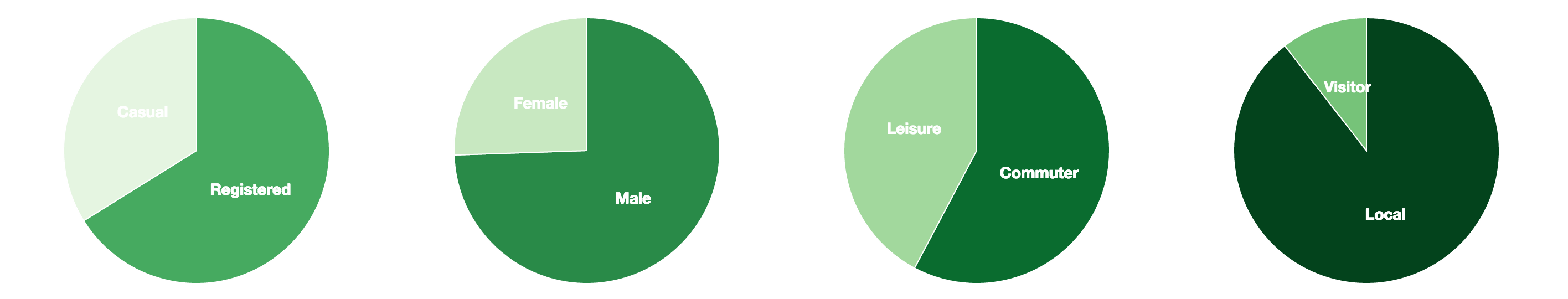 Figure 21: Final Pie Charts
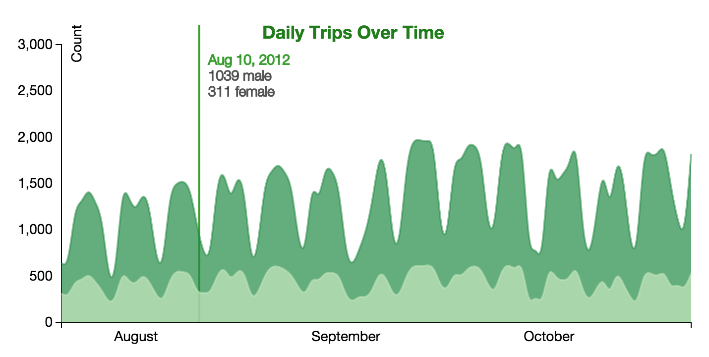 Figure 22: Final Stacked Vis with Hover
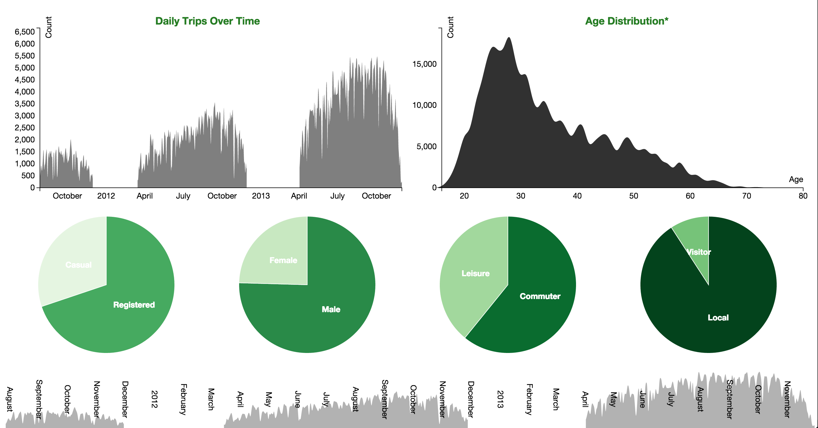 Figure 23: Final Who Page
when.html weathervis.js, whenvis.js
To answer the question of when people use Hubway, we came up with two visualizations. Ultimately, we only used one, but you can see why we made the call to eliminate WeatherVishere.
The one that made the cut was WhenVis. It is a simple overall design: an area chart. Since this design came much later in the building process than our other visualizations, we had a much more specific purpose and simplified design for it. The x-axis is the hour of the day, and the y-axis is a variable attribute of any given 15 minute period over the day. For each 15 minute period, we calculated the total number of trips taken, the total length, distance ridden, number of registered/casual/female/male/etc. users, and broke that down further between weekday and weekend. This data can be found in timeofdaydata.csv
After some client-side data processing, the result is an area chart that can be "played with." Users can view either total trip data, or a subset from either the weekend or weekday. Users can then set what attribute of the data they want to view--trip speed, trip distance, etc.
where.html chordvis.js, neighborhoodvis.js, formvis.js
The simplest component of this visualization is FormVis, which is simply the controls that appear on top of the chord diagram and trigger event handlers for which dataset should be employed.
For ChordVis, the biggest challenge was making sure the enter, append, and exit selections were all appropriately selected and altered. We grouped the stations according to neighborhood, and used a bright color scheme to differentiate between each neighborhood. On hover, the user can focus on one neighborhood and its interactions with other neighborhoods, as well as see more detail information. The entire chord vis is shown below in Figure 24 and a hovered neighborhood is shown in Figure 25.
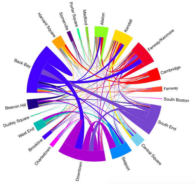 Figure 24: Chord Neighborhoods
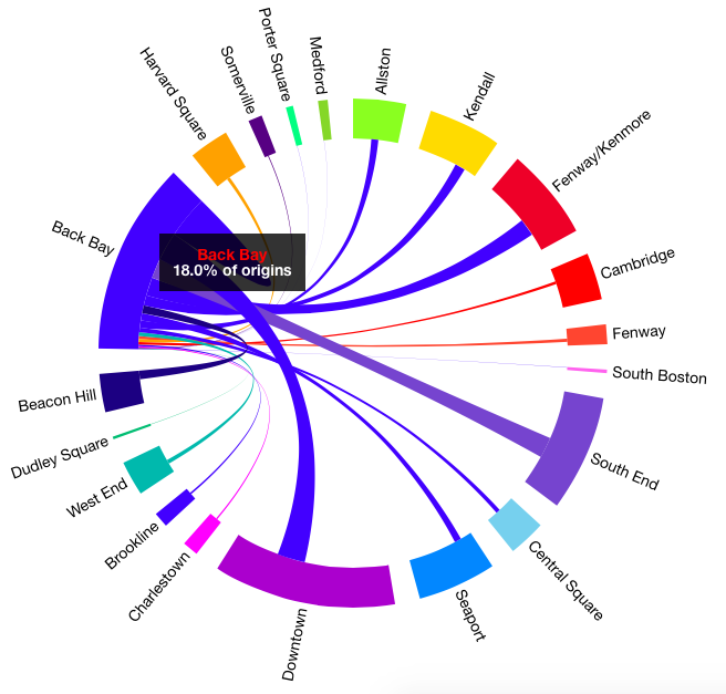 Figure 25: Hovered Neighborhood
We decided to use a more muted color scheme. In addition, we added hovers to the chords and neighborhoods. Upon hovering on a neighborhood, we see the percentage of trips that the selected neighborhood accounts for. On hovering on a chord, we see the number of trips between the two stations--in both directions. Our final design for the chord visualization is shown in Figure 26.
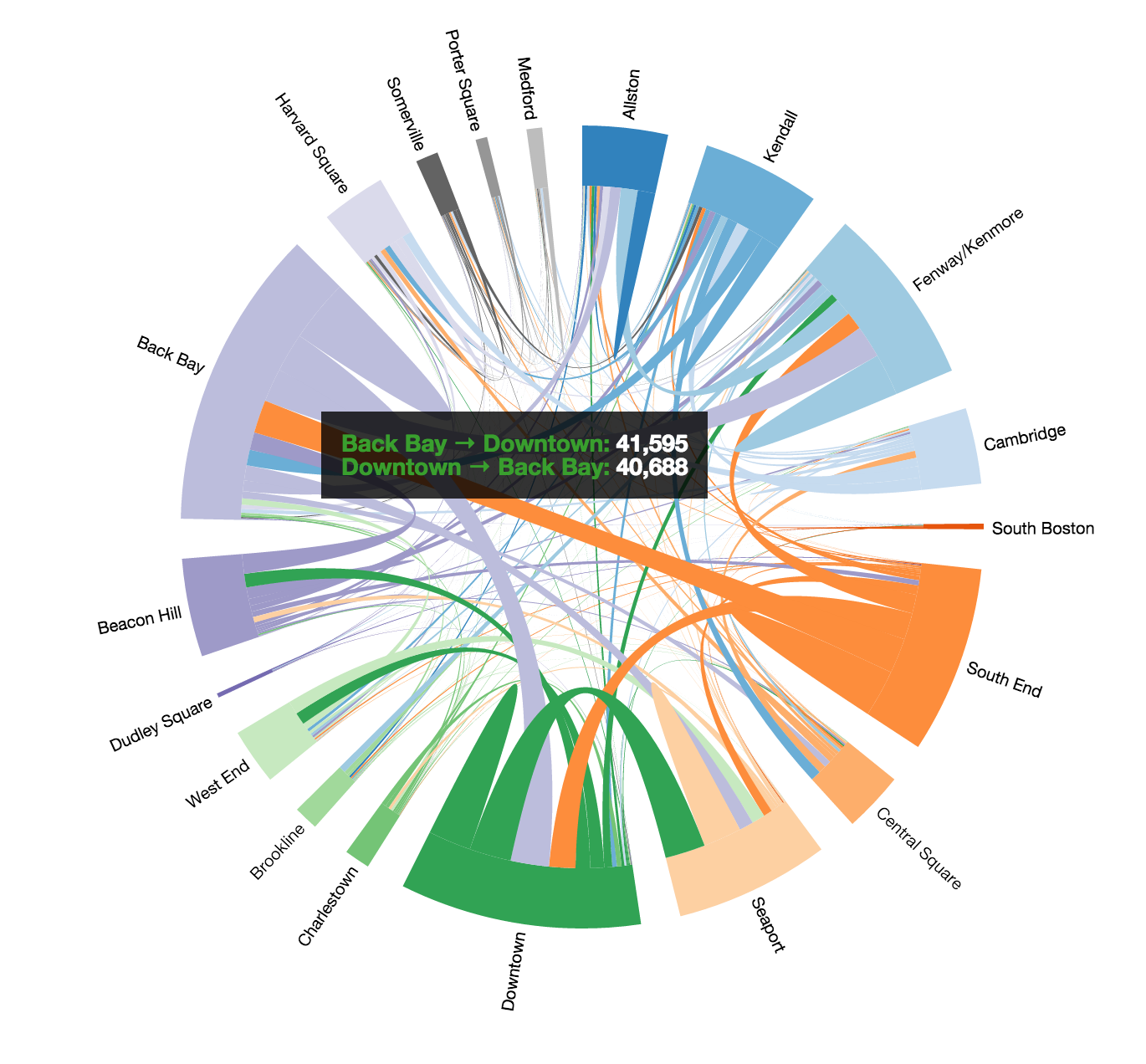 Figure 26: Final Chord Neighborhoods
Next, we created a map of these neighborhoods by modifying our original MapVis. Like MapVis, the stations on NeighborhoodVis are sized according to the traffic at each station. Furthermore, when a neighborhood is selected in the chord visualization, only the corresponding stations in that neighborhood are shown on the map. The map of all stations in neighborhoods is shown in Figure 27.
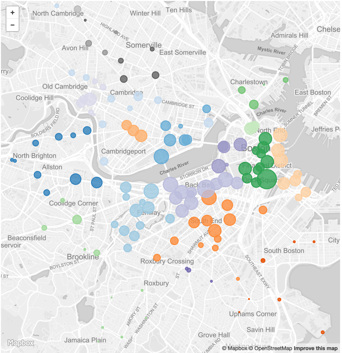 Figure 27: Neighborhoods Mapped
Lastly, we added the ability to toggle between overall data, for only weekend or weekday and for only casual or registered users. The entire where page is shown below in Figure 28. In this figure, the Back Bay neighborhood is selected on the chord visualization and thus, only the stations in the Back Bay are visible in the map.
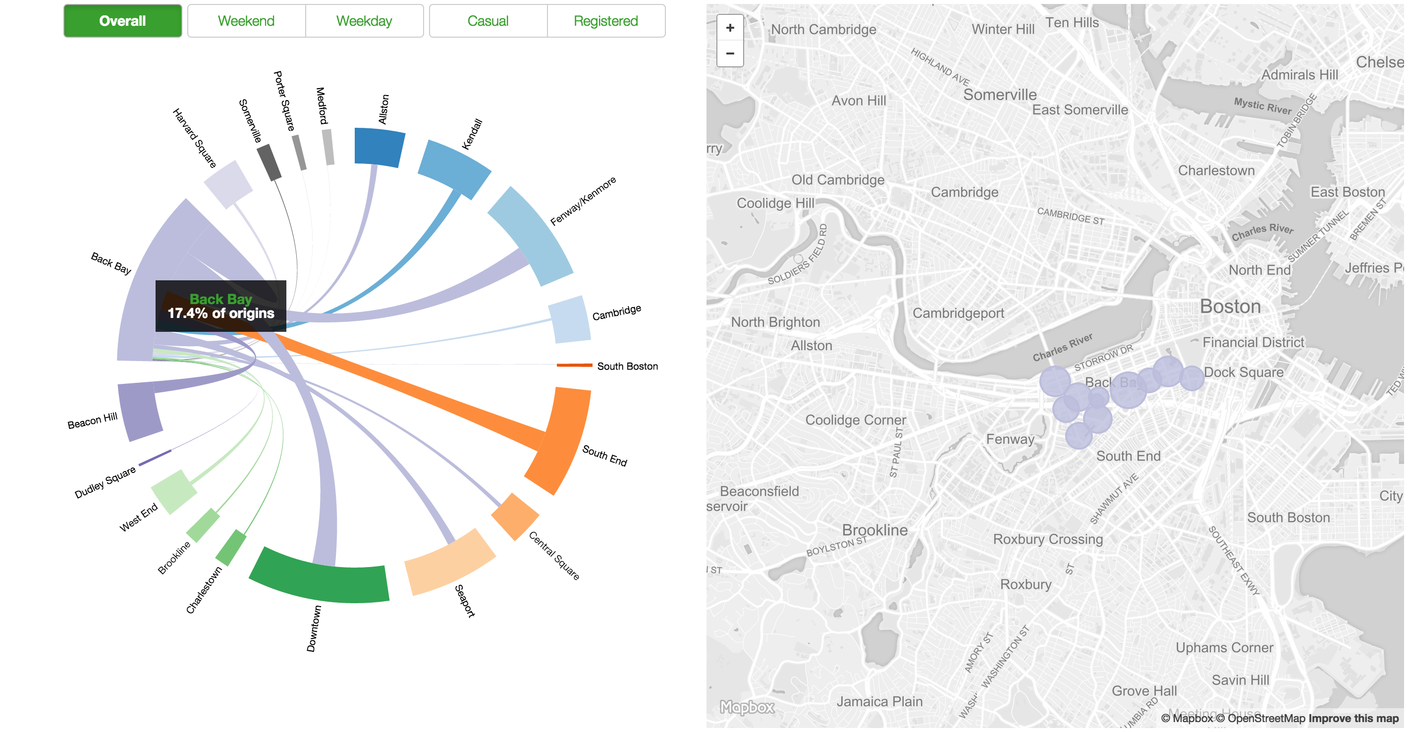 Figure 28: Final Where Page
follow.html followvis.js, runningvis.js
Having become more comfortable with using Mapbox, Leaflet, and D3 in combination, we realized we could pull off a "follow the bike" in a very basic form.
By filtering the original hubway_trips.csv file for trips made on bike B00001 and removing extraneous information, we created a data file mayorsbike.csv (for further details, see scripts).
One visualization, FollowVis controls implementing and updating the map, while the other, RunningVis keeps a "running" tally of the total distance, time, trips, and so on made by this single bike.
Instead of passing all the data to each visualization, we instead use follow.html as a sort of controller file, giving each visualization the data piece it needs at each time step. Once the controller has looped through all the data, it tells the visualizations to reset, and starts over.
In terms of design, we wanted to keep this page simple. The map was made to be dark so that as the trips were drawn, their "shadow" would be more apparent, and in general give a higher contrast between contextual information (the map) and the data (the routes drawn). When the routes are drawn, they are intially full opacity and slightly bolded. As newer trips are drawn, the old ones are faded to a set opacity, and are slightly thinner. This lets the user see each new trip plotted more clearly, as well as lends itself to creating this bike's footprint across Boston.
For the RunningVis, we had planned to keep things simply with glyphicons, one each representing a user and colored according to gender. This proved difficult as it was the opposite of simple; With so many trips, the information started flowing off the page Figure
 Figure 29: Not the simplest visualization
Instead, we opted for a simple pie chart that would be updated with each new trip. For this, we simply modified WhoPieVis to make PieVis. This new pie chart, along with running tallies of the date, how many trips have been taken, total time the bike has been used, and how far the bike has been ridden. These are shown below in Figure 30.
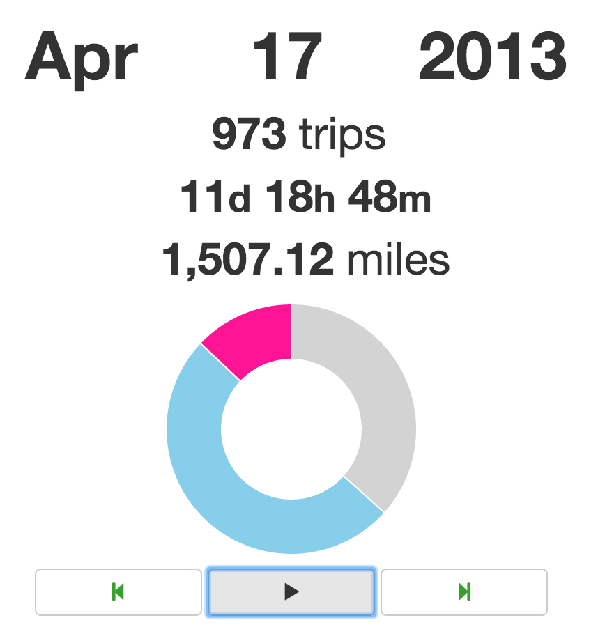 Figure 30: The Mayor's Bike Statistics
Lastly, we can see a dicontinuous area graph of the miles covered as they are tallied (in conjunction with the rest of the visualization). This ProgressVis gives the viewer an idea of how far the bike has traveled over the course of the dataset and is shown below in Figure 31.
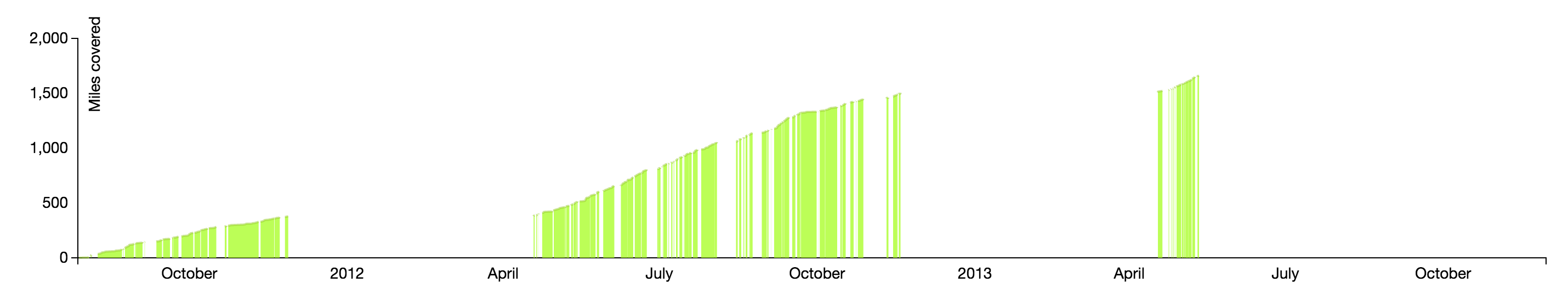 Figure 31: The Mayor's Bike Statistics
This is what the follow the bike visualization looks like at its completion.
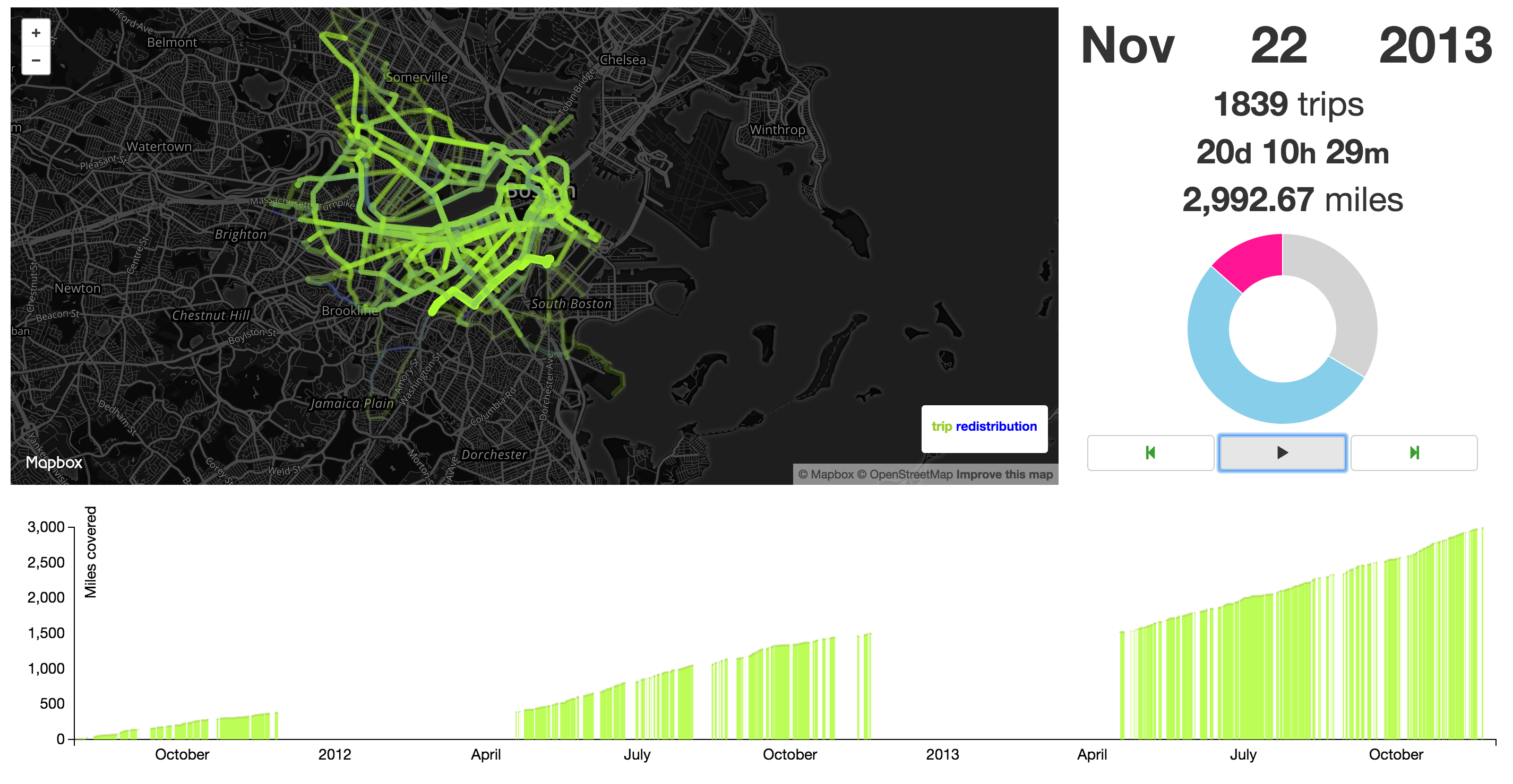 Figure 32: The Mayor's Bike
Evaluation
We set out originally to ask the who, where & when of Hubway usage. We believe we created a tool that not only helped us to discover answers to these questions, but allows other people to explore these questions as well. In the process of creating and fine-tuning our visualization, we have been able to draw interesting conclusions about these questions. From friends and roommates we have shared our datahub visualization with thus far, they have been able to draw their own conclusions as well. Below, we have put together a few basic findings as well as some not-so-basic findings about Hubway. Enjoy!
- Women don't seem to be using Hubway a lot. Or at least--not as registered users.
- There aren't many visitors using Hubway bikes.
- The Back Bay neighborhood is more popular with unregistered users and on weekends.
- The Downtown neighborhood is popular on weekdays during commuting times. Because why else would you go to the Financial District?
- Somerville City Hall has a very clear commuting pattern. There is a spike in people arriving at the station at 8am and a spike in people departing the station at 6pm.
- The longest trip was 107 days. It seems like someone forgot to return a bike. At that point though, why would you?
- There were less than 100 riders TOTAL on the days of Hurricane Sandy and Hurricane Irene.
- There are spikes in trip duration at odd hours of the night. People having a tough time getting home, perhaps?
Let us know what else you discovered!
While we certainly asked a lot of questions and were able to discover and explore answers to these questions, there are a few things we think we could have improved on. One thing we wish we think we could improve on is getting all of the features we currently have into one view. This is by no means an easy task--each of our pages uses different manipulation of the dataset and each of our pages has a complex feature set. While it would be nice in the future, to see all of this in one page, we felt that it was cleaner to show it in multiple pages at this point.