datahub
  • overview
  • who
  • where
  • when
  • follow me
  • process book

Station Info

who?

Learn More about Who

where?

  • Origins
  • Destinations

when?

Net Traffic Flow

Area corresponds to average daily traffic

That escalated quickly

We know, but we're not sorry. Too much cool data to get to.

Some questions you may have:

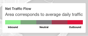
  • What do the colors mean!? The colors are indicative of the net flow of traffic at a station. Green means that there are more incoming trips that outgoing trips on a daily basis, and red means the opposite.
    If it's the numbers that are getting you, then you should know that green means roughly 60% of trips are outgoing, and red means only about 40% of trips are outgoing. The colors blend in between!
  • What do the areas mean!? The areas show the relative traffic at each station, measured by total daily arrivals and departures.
  • Why do those lines show up when I do the hover thing? Another great question. Those are the most popular trips into (green) and out of (red) of the station! If you hover over some of the smaller stations, you see that they don't have lines show up :( . That's because we only show routes that are taken more than 500 times.
  • Where can I find out more? How about here, here, or here.

Welcome to DataHub!

About Hubway
Hubway is a bicycle sharying system in the Boston area. Launched at the end of July in 2011, Hubway started with 61 stations throughout the city and 600 bicycles. In the time afterwards, Hubway expanded to the neighboring cities of Cambridge, Somerville, and Brookline. Since its launch in 2011, Hubway has grown to more than 140 stations and more than 1300 bikes.

In 2013, Hubway in partnership with the Metropolitan Area Planning Council, released data from more than a half million trips that were taken on Hubway bikes between its launch on July 28, 2011 until the end of September 2012. Their mission? Ask the public to put together a visualization of all the trip history. While the challenge itself has officially closed, we decided to take on the Hubway and MAPC visualization challenge.

The Team Datahub Way

We are Team Datahub, and we are on a mission to visualize this bike sharing platform. As students, we make use of many forms of alternative transporation to explore and commute around Boston. In particular, bikes are a popular, affordable method of transportation for students, professionals, and tourists alike. We want to understand more about who uses bikes and for what purpose, as well as how people get around Boston. Our goal is to find answers to these questions for ourselves, and create a visualization for others to discover the answers as well.